We have been live for just over fifty days now, and during that time we have kept working towards gathering feedback and adding new features.
There are a couple of major ones we would like to highlight.
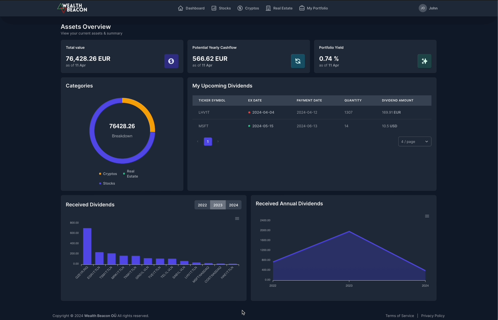
Dividend visualisation
We recently added two new widgets to our dashboard with the aim of giving you an even better overview of the dividends you have been paid.
Historically Paid Dividends Graph: This new graph allows you to view the total dividends paid over time across the various tickers in your portfolio. This visual representation helps in understanding payout trends and planning for future income based on historical data.

Total Dividends Paid Graph: Complementing the historical dividends graph, this graph aggregates the total dividends received from all assets over time. It is ideal for investors focused on income-generating assets, providing a clear picture of dividend yields and helping optimize investment strategies.
Historic data

Enhanced Historical Views: We received feedback from our users about the usability of our company view and that is something we are continuously working on. We have now added historical prices to the graph and will be adding even more company details to the view over time.
What’s up next
One piece of feedback from our first month was the lack of support for you to change the currency displayed on their dashboard. Soon, you will be able to update the default currency yourself!
Initially we will support EUR, USD, GBP, and all the Nordic currencies.